Gemma Foods
During 2020, at the height of the pandemic, Gemma Foods was born when Chef Tony Quartaro started offering his neighbors in Beverly, Illinois, restaurant-quality pasta dishes delivered right to their doors. Four years later, Gemma Foods has grown into a full-blown start-up with three brick-and-mortar stores and is sold in niche stores like Foxtrot. With all of this growth came the opportunity to examine their brand and create packaging that was ready to scale with them.
The Rebrand
Gemma Foods got its name and spirit from the Quartaro’s daughter, “the best eater they know.” When asked what the Quartaros saw this brand as, they wanted something that felt rooted in audacity, was recklessly brave and edgy, but still elevated and feminine.
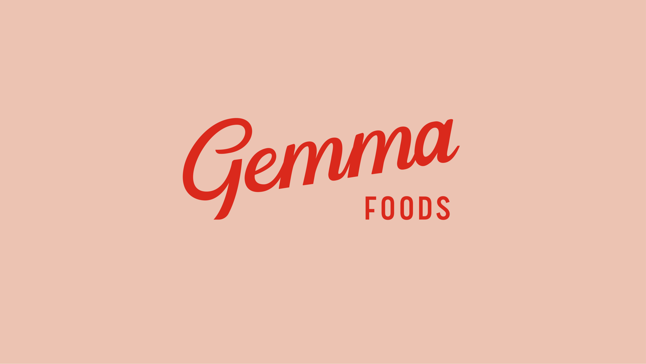
Armed with the original mono script logo, we sought to infuse some vintage flair by adding more stroke contrast and creating a custom hand-drawn brush script logo. We elevated the type pairings and allowed for the utilitarianism of the mono typeface blend with the refinement of a bold condensed type that gives a nod to the business’ Italian roots. By taking a bold vibrant red and tinting it to a warm blush, we created a monochromatic palette that plays nicely with the two secondary colors brought in for practicality and were inspired by the many shades of pasta that Gemma Foods creates.
From beginning to end, this business and brand was crafted and sculpted from tradition. It’s reminiscent of a classic neighborhood bodega but packs a whole new attitude.

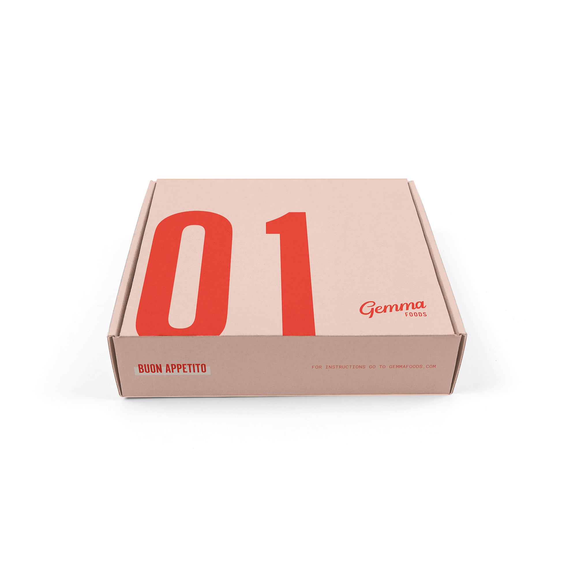
Packaging
Equipped with a new brand, Gemma Foods needed a packaging redesign that supported regional delivery, worked for their pasta pairing menu, and was simple to upkeep, but still felt upscale. They also needed to create varients for sealed frozen options and quick in-store orders.